Let’s start with my favorite pieces! These 8” x 10” landscape prints are the perfect finishing touch for any space. Their timeless style makes them easy to incorporate into your home decor. Hang them on their own as a statement piece, frame and layer them with other decor on tables, mantels and shelves, or mix them into a gallery wall. They also make a wonderful gift for any friend who appreciates thoughtful decor. Whether you’re styling a cozy reading nook, a modern living room or a serene bedroom, these prints bring warmth and nature to any room they’re in.
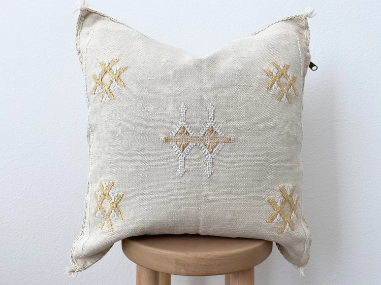
These beautiful pillows will elevate any room with their versatility, blending neutral tones and accent colors for contrast. When styling decorative pillows, start by mixing different sizes and shapes, larger pillows at the back with smaller ones in front to create depth. Layer different textures, like linen and knit, for added dimensions. Thoughtfully mix patterns, balancing bold designs with solids to create visual interest and harmony.
Ceramic vases serve as a great foundation for adding greenery or florals to your space. Their neutral tones easily compliment any arrangement making them an ideal choice for various styles. Whether you choose fresh or faux flowers, greenery and dried stems, these vases bring life, height, and texture to your decor.
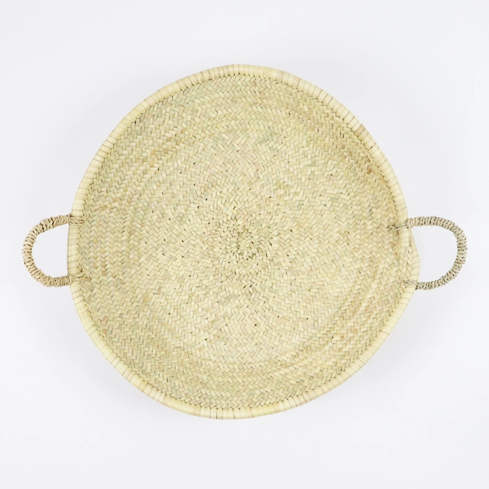
A woven tray is an incredibly versatile decor piece that can be styled in many ways. Most commonly, it's used as a centerpiece on coffee and dining tables, filled with complementary items like candles, plants, books, or decorative objects to create a layered, dimensional look. While that’s a lovely use, woven trays can also make great wall decor. Whether hung on their own or incorporated into a gallery wall, they add texture, depth and a natural touch to any room.
These beads are an excellent way to introduce a pop of colour into your decor. Whether draped around candles or layered on top of books, their natural charm brings a touch of earthiness to any space. Another unique way to incorporate these in your home are immersed into a gallery wall. Perfect for those seeking to add a bit of nature and warmth to their home, these beads are an effortless style choice.
We all need scrub brushes for our kitchens and bathrooms, so why not make them stylish? These practical tools are made even better with the beautiful bamboo texture, offering a more aesthetic option compared to traditional plastic or metal brushes. Plus, bamboo is a sustainable material, making it an eco-friendly choice for your home.
You may be wondering why an Interior Designer is selling bags and purses. Well first off, I’m always in need of a stylish and functional bag while moving between job sites. (Bonus if it fits a tape measure!) But beyond that, how often do we toss our purses on entryway benches, kitchen counters, or hang them on racks.. essentially turning them into part of our home decor? By selecting a bag that compliments your space, it becomes more than just an accessory, it enhances the aesthetic of your home blending style with practicality.
Hope you enjoyed these tips, and be sure to shop while you can before everything is gone!
-Courtney


